
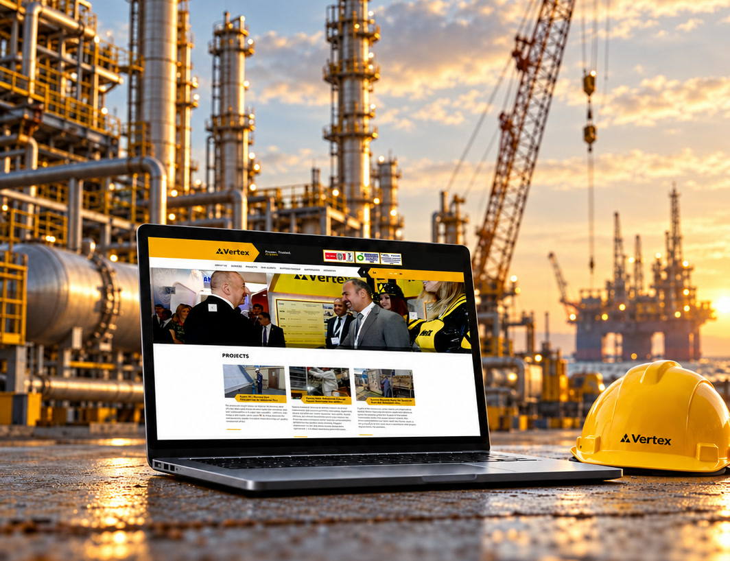
 ← All Vertex cases
Corporate website / Information design
Vertex · vertex.ws
The work was there.The story wasn’t.
Vertex already had the projects, clients and credentials. What it needed was a digital presence that brought them together and made the scale of the company clear at a glance.
01
The Goal
Present Vertex’s capabilities, experience and wide range of services in a simple, clear way.
A visual language that helps the company present itself as precisely as possible.
02
The Challenge
How do you lay out a huge body of experience so that anyone can find their way in it?
Every service had to be listed, and projects had to be sortable by service and by client, conveniently.
03
The Solution
Organize the evidence.
A clear structure that goes from what Vertex does to who it works for, what it has delivered and what standards it meets.
The Approach
Turning experience into evidence.
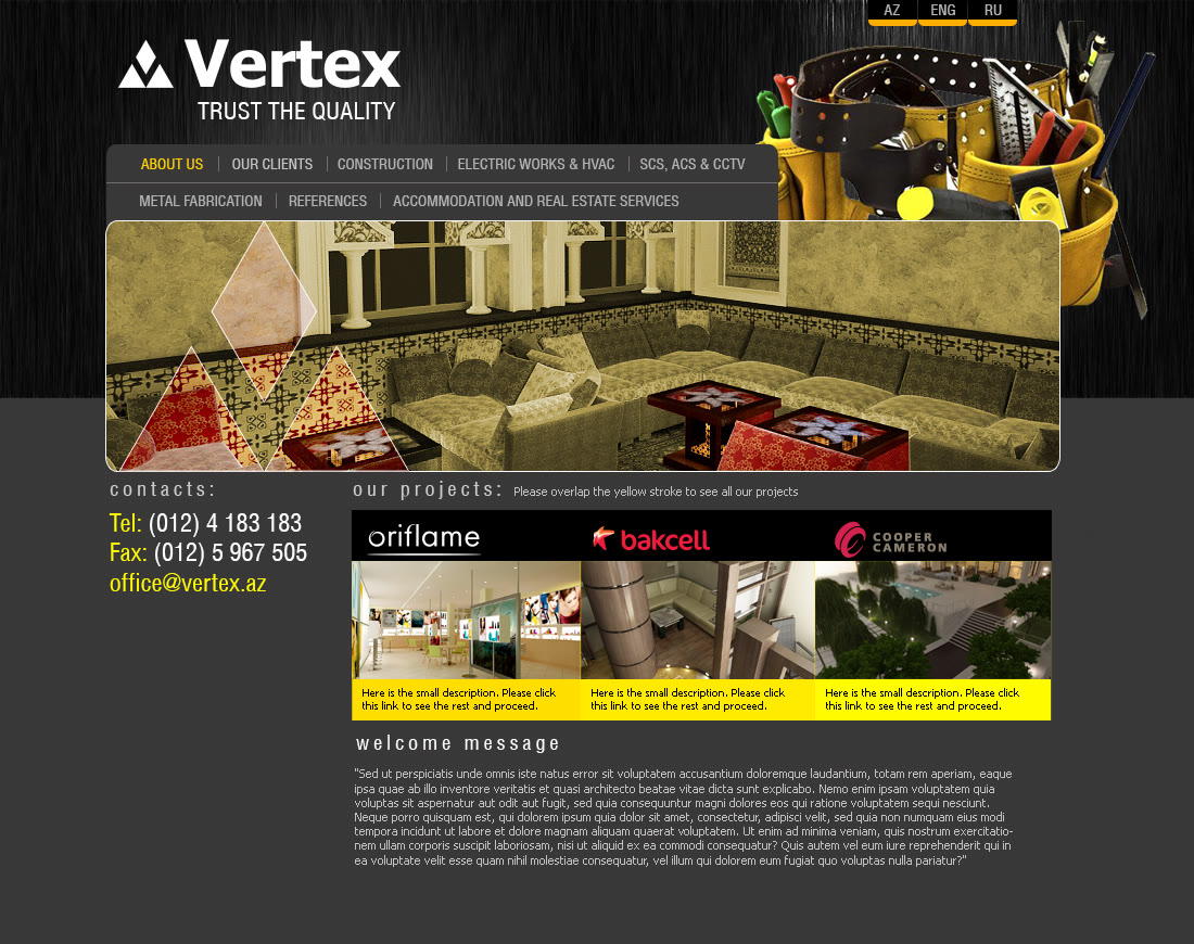
By 2016 Vertex had strong projects, major clients, certificates and several lines of business. They existed separately, and the old site could not show the scale of the company at a glance.
So we started with what the company has to tell the market. The interface came second.
Before and After
The site, then and now.
The Strategic Idea
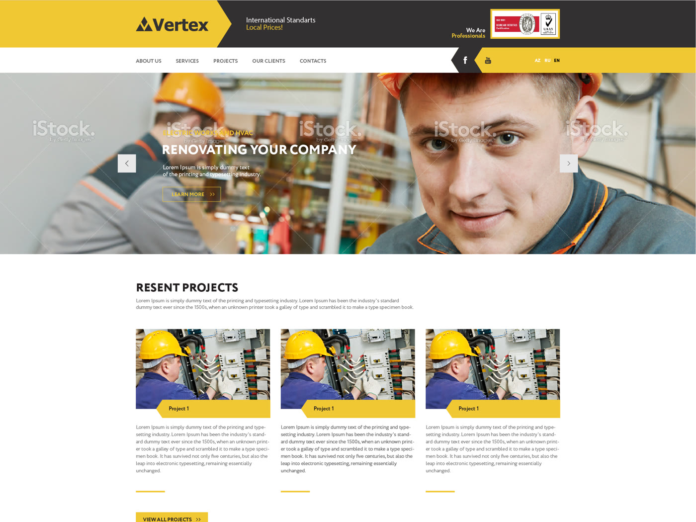
International standards.
Local prices.
The line was already in the header of the 2016 design. Three years later, at Baku Oil & Gas 2019, the same idea took over a stand.
See the stand caseThe Structure
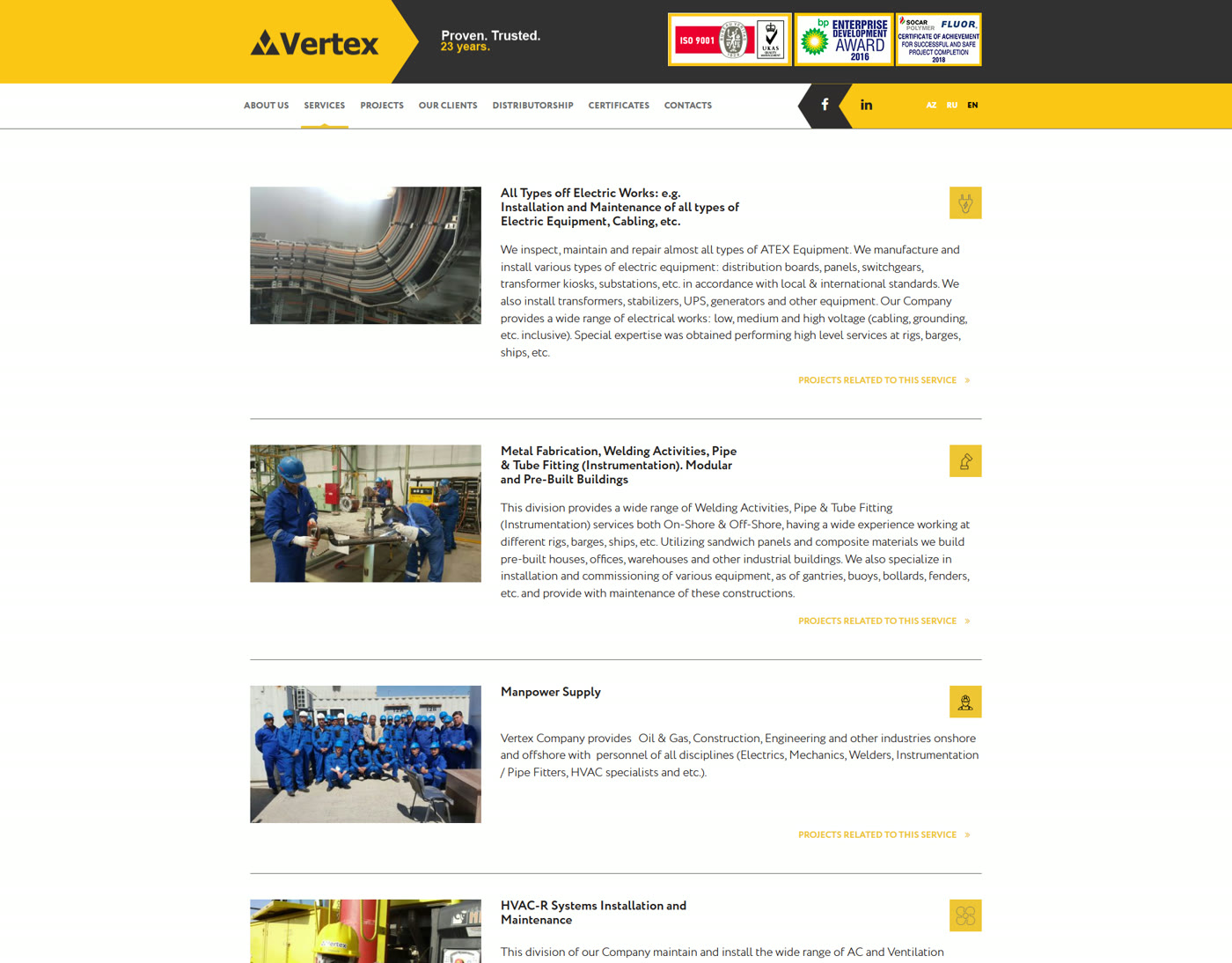
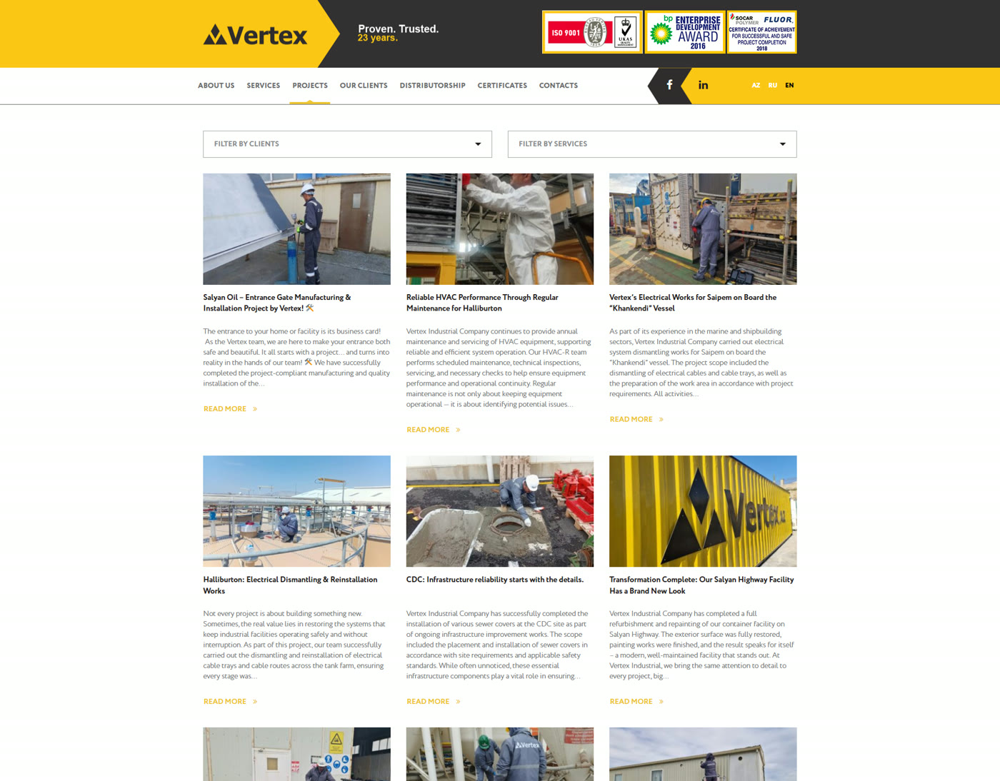
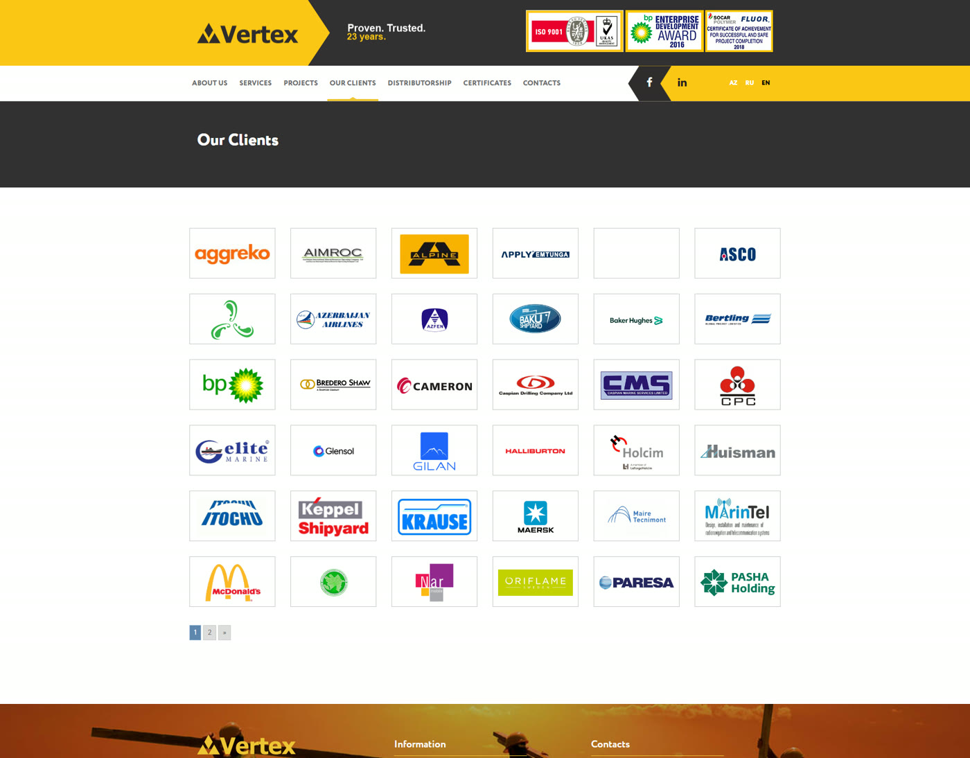
Every service listed. Every project sortable.
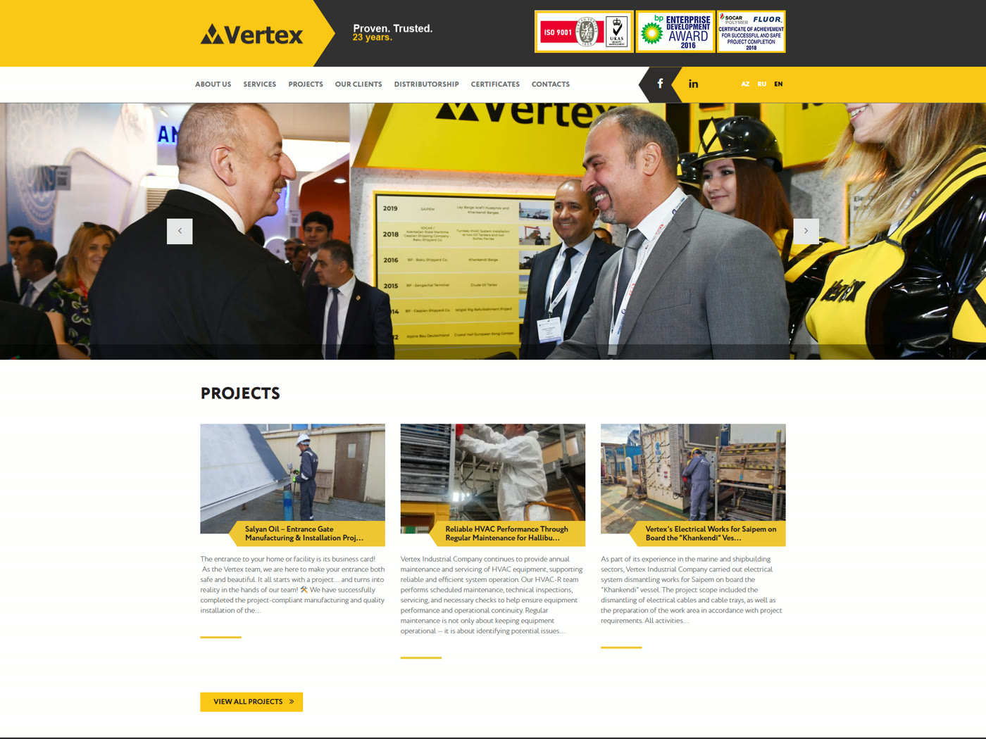
All services in one place. Projects that can be filtered by service and by client. The full list of clients. Plus distributorship, certificates and references, in Azerbaijani, Russian and English.
Key Details
Credentials in the header of every page.
ISO 9001, the bp Enterprise Development Award 2016 and a SOCAR / Fluor certificate of achievement: proof that sits above everything else, before the first click.

The Result
A site that kept working.
Launched in April 2017, vertex.ws is still the main tool the company uses to present itself.
Today the slider on its home page opens with the President’s visit to the Vertex stand at Baku Oil & Gas 2019. Two cases, one story.